Muditha Zero Waste UX
Crafted a unique website for the first Zero Waste online Supermarket in India.
Muditha Zero Waste needed a full website redesign to improve user experience and business performance. Primary goals: increase average session duration, reduce cart abandonment, and grow the customer base through a more intuitive, educational digital experience.
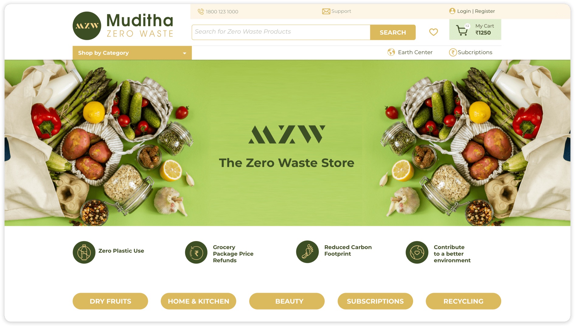
User testing sessions revealed significant friction in the checkout flow and product discovery. Competitors were either too text-heavy or lacked practical guidance on zero-waste living. Users wanted education built into the shopping journey — not as a separate blog.
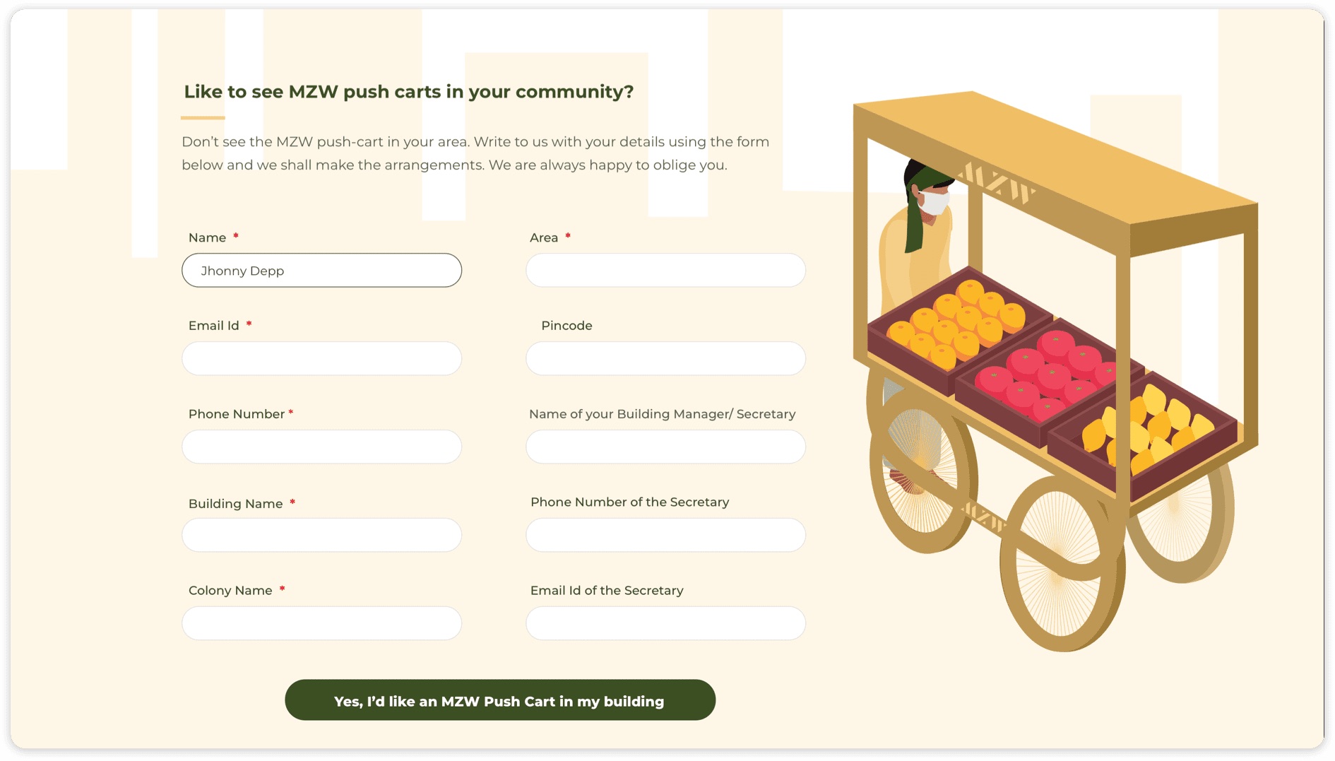
Target Users: Eco-curious newcomers and committed zero-wasters — two distinct segments requiring different levels of guidance.
UX Objectives: Reduce friction in the purchase path; educate without overwhelming; make zero-waste feel achievable, not aspirational.
- Clear navigation with smart filtering by lifestyle, room, and impact level
- Product pages integrating benefits, How to Use, and refill instructions in one flow
- Visual progress indicators showing environmental impact of each purchase
- Success Stories section integrating user-generated content throughout the experience
Primary: ITC Avant Garde — geometric and distinctive for headlines.
Secondary: Gothic Std Demi (bolder weight) — used for subheadings to create clear visual hierarchy without introducing a third typeface.
- Photography constraints: Product photography was difficult at early stage — needed a visual solution that didn't look low-budget
- Icon ambiguity: Refill and return icons were cryptic to new users, causing checkout abandonment
- Search lacking autocomplete: Users searching for specific products often gave up before finding results
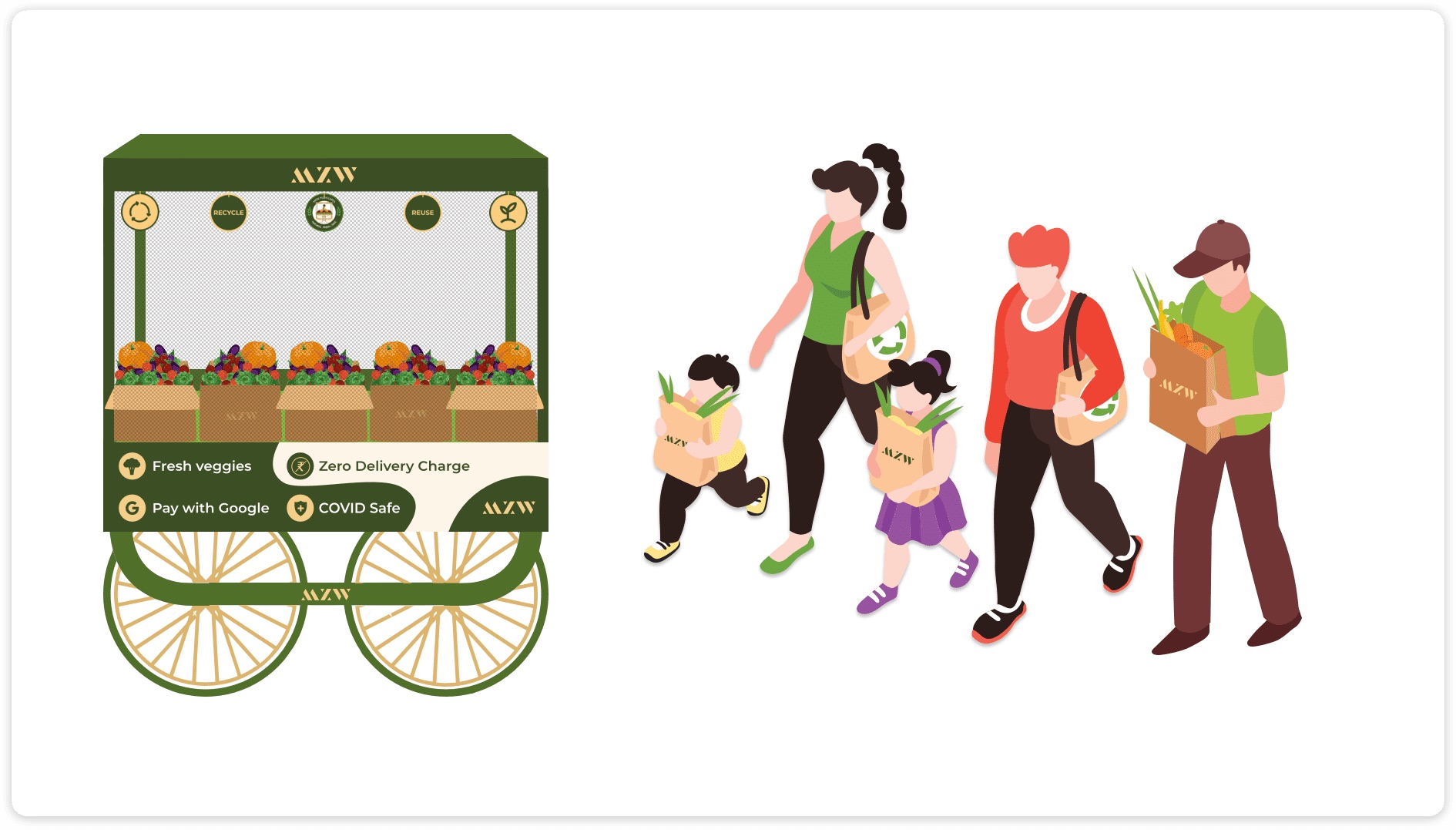
- Stylised illustrations: Custom illustrations became a signature visual language, solving photography gaps elegantly
- Labelled icons: "Refill Pouch" and "Compostable Container" labels added below all action icons — zero ambiguity
- Autocomplete search: Implemented intelligent search with category suggestions and product thumbnails
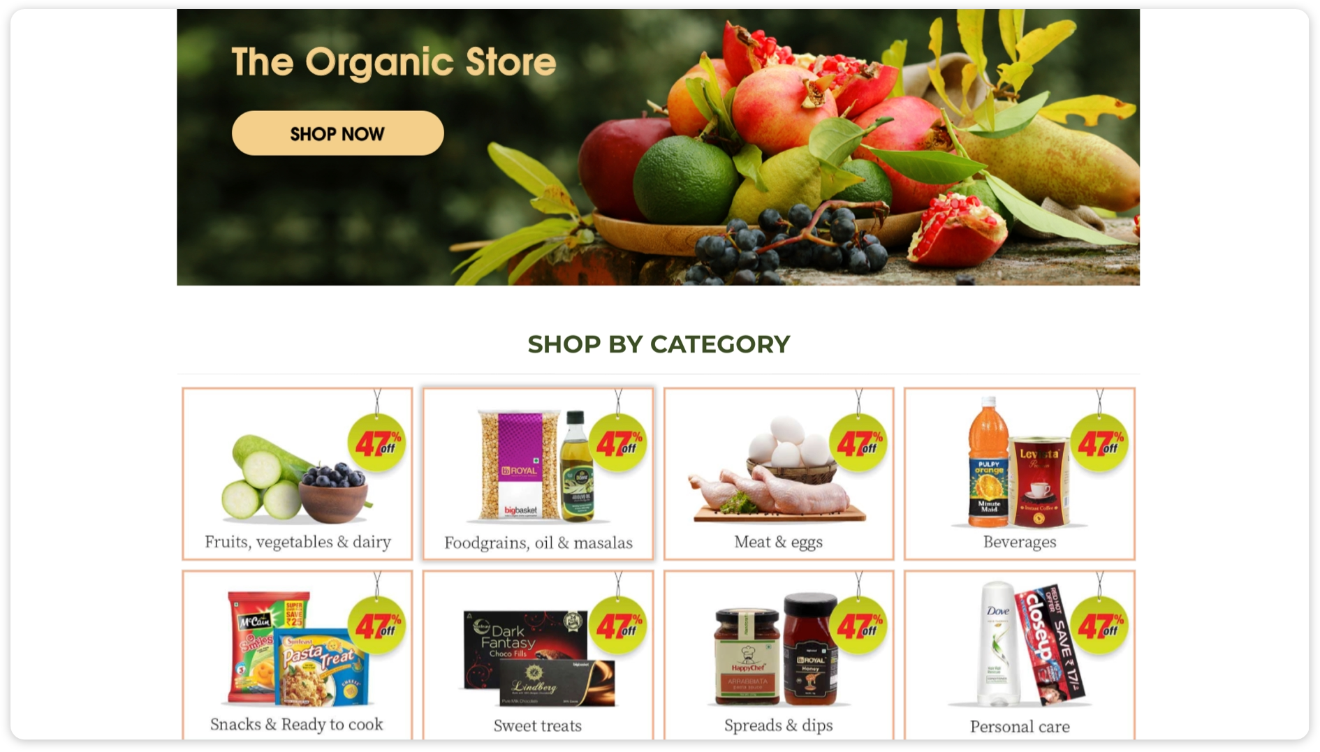
- Zero-waste shopping needs to be as usable as conventional e-commerce to succeed at scale
- Small visual cues — like labelled icons — can have outsized behavioural impact on conversion
- Success stories and social proof build community, not just credibility
Ready to elevate your brand?
Start free. No commitment until you see what we find.